
Blue can be as small as a pillow, a ceramic vase or a lamp you can pack when you move, or as big as blue kitchen cabinets and walls painted from baseboard to ceiling.
What you’re allowed to change decides where to start: renters get the most from pillows, curtains, art and a blue table setting, while owners can take on walls, wallpaper and cabinet accents.
Undertone decides whether any of it looks right, so tape a large swatch to the wall and watch it in morning, afternoon and evening light.
1. Blue Walls

Painting a single wall blue sets a room’s mood fast, and carrying the color across every wall sets it even harder.
I like the full wrap: pale blue on both the paneling and the ceiling pulls everything under one soft shell. Warm wood and a patterned floor look good against it.
If you rent or feel unsure, start with one wall and live with it for a few weeks before painting the rest.
2. Blue Accessories

Bowls, blankets and a painting can bring blue into a room without a single can of paint or a new sofa. Because everything is movable, you can rearrange it, swap it, or pack it up when you move.
I’d pick one blue and repeat it across several pieces of different sizes, so the objects read as a group instead of scattered extras. White furniture and curtains give them a quiet backdrop.
3. Blue and White

Navy stripes on a white sofa are about as easy as blue gets. Repeating the stripe in 2 places, pillows and a rug, ties the room together, and I’d keep everything else solid so the pattern doesn’t get busy.
The ship’s wheel and nautical art push the look firmly coastal. One or two of those props is plenty for me; any more and the room starts to feel like a theme.
4. Blue Living Rooms

Gray is a forgiving base for a blue living room, since the blue has room to stand out.
Start small with pillows and a throw, then let a rug do the heavy lifting if you want the color to feel intentional.
A blue and gray patterned rug links the 2 colors, so the sectional and the accents look planned together.
Going further, with blue on a wall or a large chair, makes the space feel far more immersive. I’d add that step only after the smaller pieces feel right.
5. Blue and Brass

Brass gives blue a warm partner, and a bathroom is a tidy place to try it.
Blue floral wallpaper behind a brass-framed mirror, brass lighting and a brass vanity base with a marble top looks cohesive because the metal repeats 3 times.
I’d match the finishes as closely as possible; a mix of golds that don’t quite agree is more noticeable against a patterned wall.
Wallpaper plus metal already gives you plenty to look at, so a plain woven rug is a good call underfoot.
6. Blue Patterns
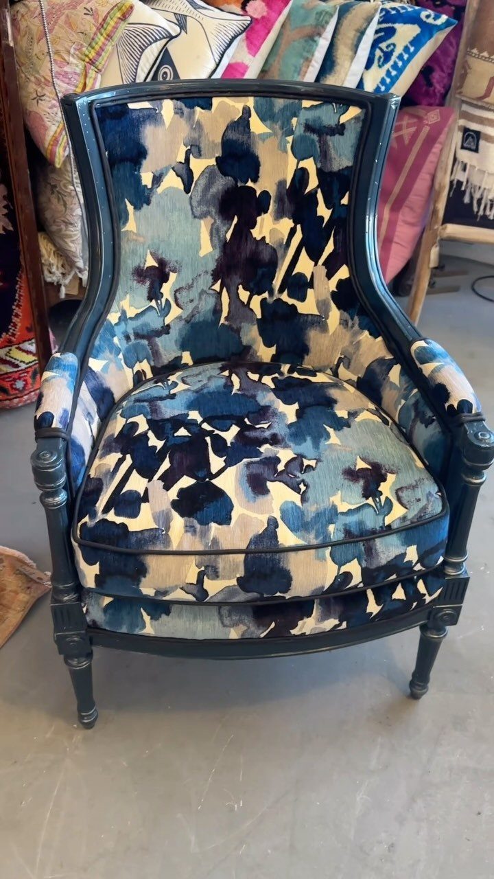
One bold blue pattern, like the abstract print on this armchair, can carry a whole corner. Navy and light blue on a cream ground keeps the pattern from feeling heavy, and a dark frame grounds it.
I’d let the chair be the one big statement and keep nearby pillows, throws and rugs smaller in scale or plain.
If you’re nervous about committing to a large piece, patterned pillows in matching blues give you the same effect at a smaller price.
7. Blue Bedrooms

A bedroom works best in blue when the color shows up in softer, fabric-based pieces. Floral bedding in blue and white, a blue lamp and one blue painting give the room a calm, layered feel without a single painted wall.
I’d keep the florals on the bed and let the lamp and art repeat the same blue, so your eye settles instead of hopping around.
Since linens are the easiest thing to swap, this is a low-risk way to test blue where you sleep.
8. Blue Wallpaper

Wallpaper turns a small bathroom into the room people remember.
Light blue floral wallpaper above white wainscoting splits the wall into 2 clear zones, and a touch of gold on a mirror frame or a light fixture warms up all that cool color.
Hanging paper on only the top half also means less to buy and less to hang. For a weekend job, I’d pick this over papering floor to ceiling.
If you want a fully wrapped room, carry the same paper up to the ceiling.
9. Blue Ceramics

Blue and white porcelain does its best work when you group it. A wooden hutch packed with tea sets reads as one collection, and a matching jar on the counter pulls the look out into the room.
Thrift stores and estate sales are where I’d hunt, since mixed pieces look better together than a single boxed set. Stick to blue and white so the shelves stay cohesive.
10. Blue Art

3 matching frames in navy abstract prints give a white sofa a clear focal point. Hanging them as a row keeps the wall tidy, and a blue pillow below echoes the color so the art doesn’t feel disconnected.
Art is the lowest-commitment way to bring in blue, because you can restyle the wall in an afternoon. I’d stay with one shade of blue across the set; mixing several makes a trio look accidental.
11. Blue Kitchens

Deep blue cabinets make a kitchen feel grounded, especially next to dark marble counters. Deep blue cabinets get dramatic fast, and green plants, hung from the ceiling or set on the counters, keep the room from feeling heavy.
The orange patterned rug is the detail I’d copy. Orange sits opposite blue on the color wheel, so a small dose adds energy fast.
If a full cabinet repaint feels like too much, blue on just the lowers is a smaller step. Dishware and a backsplash are even lighter options.
12. Blue with Rattan
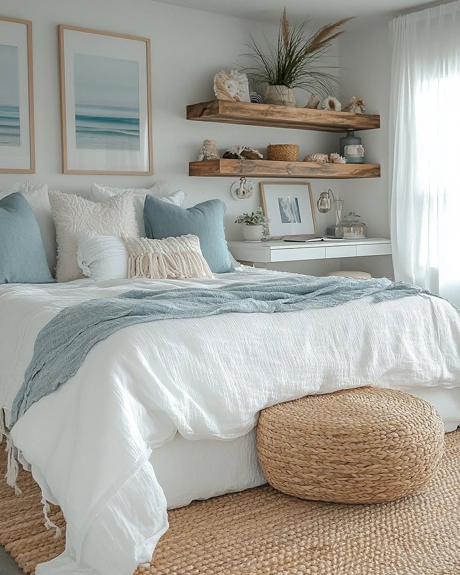
Rattan and blue get along because the natural texture softens the color. A large rattan pouf on a jute rug adds weight to a bedroom, while blue pillows and a throw on a white bed keep the palette clean.
I’d stick with 2 woven textures at most. Rattan plus jute already covers it, and wooden shelves on the wall round out the warmth.
A pouf also doubles as a footrest or an extra seat, which makes it a useful buy and not just a decorative one.
"There is a classic crispness to blue and white, and woven natural materials counterbalance that crispness with rustic texture," said designer Mark D. Sikes, author of Beautiful.
13. Blue Rugs

A striped rug in blue and navy keeps a blue-heavy living room from floating.
Blue walls, blue chairs and a blue sofa already carry the color up high, so the rug anchors it at floor level and ties the seating into one group.
I’d choose a rug that’s darker than the upholstery so the furniture stays the focus.
14. Blue and Green Wallpaper

Dark blue paired with green reads like a jungle at dusk, and tropical leaf wallpaper with blue butterflies is the easiest way to get both colors in one go.
A green daybed against it keeps the green going in the furniture instead of leaving it all on the wall.
I’d repeat the blue in a couple of pillows so the bed and the paper feel related. Dried flowers in a vase and a plain wooden side table give your eye somewhere quiet to rest.
15. Blue Curtains

Patterned curtains in light blue can set the color scheme for a mostly white bedroom.
Hung to frame the windows, they put blue at eye level on both sides of the room, and the bed, bench and wall art can pick up the same shade.
Against white paneling, I’d keep the curtain pattern small and soft. Bold prints would fight the artwork.
16. Blue Pillows and Throws

Pillows are where I’d test blue on a sofa, since the swap takes seconds. Blue and gray patterned covers on a light vintage sofa look planned, not random, when the grays echo the sofa’s own tone.
Mix two or three patterns from one color family and vary their scale: one larger print, one small, one plain.
A blue throw folded over an arm adds a final layer. Covers cost far less than reupholstering, and they store flat.
17. Blue Entry Wall
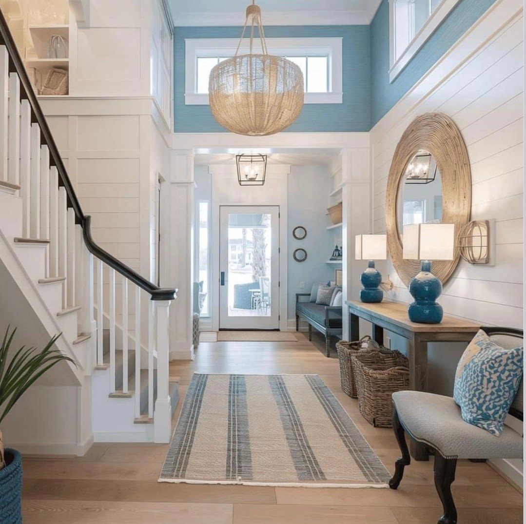
Light blue on the upper half of an entry wall, with white shiplap below, gives a small landing a clear start and finish.
The color sits at eye level, where guests look first, and the white keeps the space from feeling closed in.
A pair of blue lamps on a wooden console repeats it nicely. I’d add a striped rug and a rattan pendant for texture, then stop; an entry is a passing space and doesn’t need much more.
18. Blue Bathrooms

Going all in on deep blue works in a bathroom because the room is small and you spend short stretches in it.
Blue walls, a blue vanity and a starry blue ceiling make a cocoon, and white marble on the floor and walls keeps it crisp.
Letting white marble run across both the floor and the walls to balance the dark blue is what I’d copy. If the full look is too much, paint just the vanity or add blue towels and a blue accessory set.
19. Blue Velvet Chair Seats

A light blue velvet seat on a carved wooden chair is a small piece with a lot of softness in it. Velvet takes color deeply, so even a pale blue reads rich against dark, ornate wood.
Keep the wall behind a carved velvet chair plain, something muted like a soft peach, so the carving stays the detail people notice. Warm peach and powder blue sit comfortably together.
If you find a vintage chair with a tired seat, recovering just the cushion in blue velvet is a project that suits a free weekend.
20. Blue and Mustard

Navy and mustard make a pair that holds its own in a living room. Mustard is a warm yellow with a little brown in it, so it settles beside a deep blue sofa instead of fighting it.
One mustard armchair is enough for me. A striped rug that picks up the blues ties the 2 colors together, and a single piece of nautical art finishes the corner.
If the yellow feels loud, start with a mustard pillow or throw before buying a chair.
21. Blue Cabinet Accents

Navy cabinets, upper and lower, give a kitchen a deep, tailored base, and gold handles warm up all that dark color.
A blue and white patterned backsplash repeats the cabinet shade, so the tile feels chosen to go with the cabinets.
White counters keep the room bright. I’d match the gold on every pull so the hardware reads as one finish.
Painting is the cheaper route to this look. Another option is to paint only the lowers and leave the uppers light.
22. Blue and Red
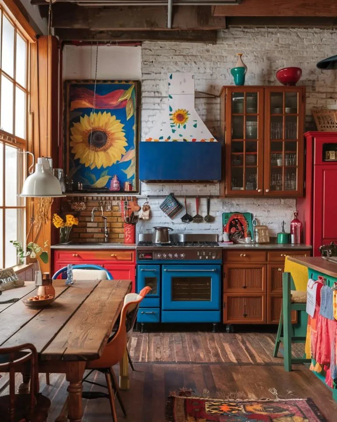
Red cabinets next to a bright blue stove make a kitchen that is bold on purpose. Both colors are saturated, so they hold each other up instead of one winning.
Blue and red read best against a quiet backdrop like white brick, and a wooden table adds the warmth that keeps the pairing from feeling cold. I’d keep the walls neutral and let the appliance and cabinets do the talking.
If red cabinets feel like too much, try one red piece, like a stool or a dish towel, against blue.
23. Blue and Pink

Pink walls with a blue floral rug turn a dining room into something playful but still put together. Pink supplies the warmth, and blue dishes on a wooden table cool it down.
Pink chairs keep the color going at seat height. I’d choose a rug that carries both colors so the walls and floor feel related.
Green plates, like the ones here, add a third color without crowding the scheme. For a smaller step, try blue dishes on a table in a pink room.
24. Light Blue and Light Gray

Light blue and light gray make a living room feel calm and a little spa-like. Both colors are quiet, so texture does the work: a gray sectional, a textured gray armchair and a wooden coffee table bring depth.
A white fireplace keeps the blue-gray walls from turning flat. I’d choose a blue with some gray in it, so it sits next to the furniture comfortably.
Warm wood, like the coffee table, stops the palette from going cold.
25. Blue with Brass Lighting

Brass takes the chill off a deep blue wall. 2 sconces on a paneled blue wall, a gold ceiling fixture and a gray tufted headboard make the color feel warm and finished instead of stark.
Brass fixtures look best when every piece shares the same finish, so pick one tone, either warm polished or aged, and repeat it on the pendant, sconces and cabinet pulls.
Sconces on each side of the bed also free up the nightstands.
If repainting paneling feels like a big step, brass lamps or a single brass fixture against a blue wall give you a smaller version.
26. Blue Chinoiserie Lamp

A pair of blue chinoiserie lamps is a small way to bring blue and white into a bedroom that is otherwise bright and neutral.
Matching lamps on white nightstands set a symmetrical frame around the bed, and the blue repeats in the linens.
Used as a pair, the lamps look deliberate. A single one can work on a dresser or desk if you want less.
I’d keep the walls white and let the lamps be the one patterned thing at that height.
27. Blue Table Setting
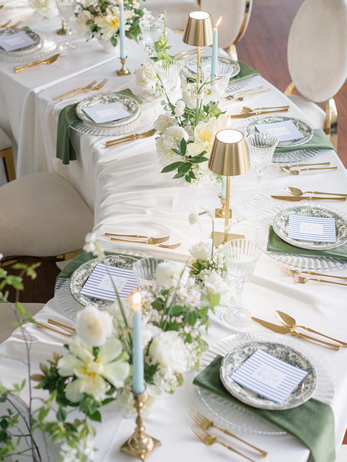
Light blue taper candles are the easiest way to put blue on a formal table.
Blue glassware or candleholders sit at eye level on a table, so against white linen and gold flatware they add a cool note that frames the whole setting.
Blue-striped napkins repeat the color at plate level, so the candles don’t feel like a stray accent. 2 blue elements are enough for a table; let white and gold handle everything else so the blue stays the accent.
Candles and napkins are cheap to swap, and they put away flat, which suits a one-evening table.
28. Blue and Orange

Orange against blue makes a console table feel seasonal without any fuss.
To pair blue with orange, let light blue lamps hold the cool side and bring in the orange through seasonal pieces like autumn foliage or pumpkins; a blue pillow tucked into a basket ties the two together.
A round mirror overhead gives the arrangement a frame. I’d keep the orange to a few pieces and the blue to a few more, so neither color takes over.
Since the foliage and pumpkins are easy to swap out, the blue lamps can stay put through other seasons.
Avoid Cold or Flat Schemes
Blue turns icy or impersonal when its undertone and its pairings are off. Gentle blues suit a restful bedroom, while bright turquoise or lapis-style tones bring drama to a dining room.
In an all-blue room, vary the shades instead of matching them.
Soft aqua walls with a sofa one step deeper, plus a rug in a darker blue with off-white stripes, give the eye layers, and repeating that off-white in the cushions ties them together.
Texture keeps a tonal scheme from going flat. Bouclé, velvet and wool all catch light differently, so the room reads rich instead of one note.
Then add warmth with a wood, a metal or one warm color, in small amounts.
Test Blue in Changing Light
Put a large swatch on the wall and look at it in the morning, afternoon and evening. Check it under warm bulbs and cool ones too, since natural light shifts a blue a lot over a day.
Room direction changes what you see. North- to east-facing rooms get cooler light, so a blue with a warmer undertone tends to hold up better; south- to west-facing rooms can take cooler blues.
Pick the mood before the shade:
- Navy to ground a space
- Blue with plenty of gray mixed in leans Scandinavian, especially next to pale wood and white trim.
- Jewel tones for something dramatic
Then test only the shades in that group.
Choose Patterns with Care
Some patterns carry a style with them. Blue stripes and small-scale romantic florals read coastal or country fast, so if that isn’t your look, lean toward geometrics or larger abstracts and pick accessories on purpose.
Blue works as the common thread when you mix patterns. Stripes, florals, geometrics and solids sit well together when blue is the shared color.
Pick a wallpaper pattern that sits in the background of the room, so the furniture and art still get noticed. A few vases or framed prints in matching blues will carry the paper’s color into the rest of the space.
On a bookcase, vary the shapes, sizes, materials and heights of what you display. Leave some white space so each object has room to be seen.
Frequently Asked Questions
What colors go best with blues?
White and gray are the calm choices, and they let the blue stand out. Pick one warm color or metal and use it in small amounts.
Is blue a good color for living rooms?
Yes. Blue is versatile enough to suit traditional, modern and cottage-style rooms, and the mood can run from calm to cozy.
I’d start with blue pillows and a throw on a gray or white base, add a patterned rug next, and paint a wall or buy a large blue chair only once the smaller pieces feel right.
What are undertones?
An undertone is the color mixed beneath the main color, and it decides whether a blue feels warmer or cooler. A blue leaning toward purple-red reads warmer, while one leaning toward green reads cooler.
Paint a roughly 2-foot square sample on the wall and look at it at 8 a.m., at 2 p.m. and again under lamps at night, because the same blue can lean green in one light and purple in another.