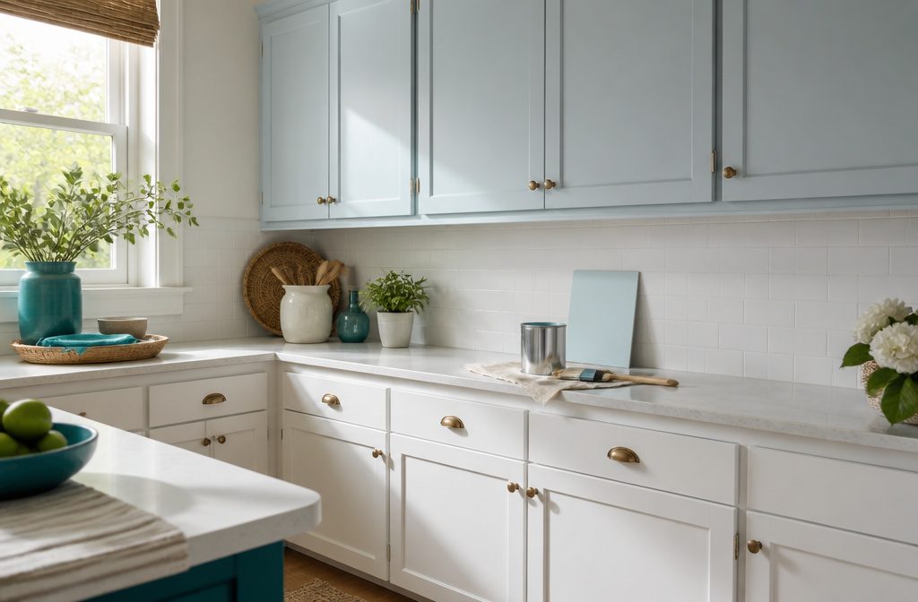
Light blue kitchen paint is a pale blue for walls or cabinets, and it can lean gray, green or purple as daylight gives way to pendants and under-cabinet strips.
Even Sherwin-Williams Icelandic, a powder blue with a 67.48 LRV, needs a sample on your own wall before you buy a gallon.
My Top Picks
| Product | Award | Best for | Why it won | ||
|---|---|---|---|---|---|
 | Benjamin Moore Ice Cap | Best overall for shoppers seeking a versatile light blue kitchen paint | Shoppers wanting one versatile light blue | Balanced all-rounder: verified kitchen-suitable satin or pearl interior finish from a trusted brand and color | Check price |
 | Sherwin-Williams Upward | Best for sample-first shoppers who want to preview before committing | Buyers who must preview color first | Real-paint peel-and-stick samples let you test the color at home before committing. | Check price |
 | Sherwin-Williams Icelandic | Best for a kitchen that needs a powder-blue wall backdrop | Wall-focused shoppers wanting subtle powder blue | A designer describes it as a subtle powder blue that works as a kitchen backdrop. | Check price |
 | Farrow & Ball Cook’s | Best for shoppers choosing a bright, vibrant blue rather than a pale kitchen blu | Buyers choosing bold blue over pale | Verified interior paint in many finishes, including full gloss, with samples and photos to judge the color. | Check price |
 | Behr Sky Light | Best light blue for cabinets | Cabinet painters wanting light blue | Suggested specifically for kitchen cabinetry, making it the clearest light blue match for cabinets. | Check price |
 | Farrow & Ball Middle Ground | Best for shoppers who want an aqua-leaning blue and can order a made-to-order co | Aqua-leaning blue fans, patient with custom orders | The manufacturer calls it aqua-leaning, and its undertones and archive-color status are well documented. | Check price |
 | Farrow & Ball Oval Room | Best for changing natural light | Kitchens with shifting natural light | Offered in finishes for both walls and wood, so you can use it throughout the room. | Check price |
 | Benjamin Moore Windy Sky | Best for shoppers wanting an airy, light pastel blue for kitchen walls | Airy pastel blue for kitchen walls | Described as a light, bright pastel blue that suits airy kitchen walls. | Check price |
Best overall for shoppers seeking a versatile light blue kitchen paint: Benjamin Moore Ice Cap
Prestige Paints has created a comparable Color based on Color specifications of the original Color using industry leading technology This Benjamin Moore paint Color Name is a...
Quick Verdict
A designer calls this pale blue so light it can almost pass for a neutral, which makes it a reasonable pick for a kitchen that wants a touch of blue without a bold statement.
That near-neutral quality is its strongest point. The real weakness is how little the sources I read say about undertone, so a sample on your own wall matters before you buy a gallon.
What It Does Well
- Designer Grace Brackman calls it a light blue, so you start in the right color family for a light-blue kitchen.
- She describes it as so pale it can almost serve as a neutral, which suggests it may sit quietly beside existing countertops and flooring.
- She likes it on cabinetry, a useful signal if you are weighing blue cabinets instead of blue walls.
Where It Falls Short
- Undertone behavior is not established in the sources I found, so which direction it leans is unconfirmed.
- I found no in-room photos or owner reports showing it in a finished kitchen.
- Sample access and how it coordinates with existing finishes are also undocumented.
Who It’s For
Anyone repainting a kitchen who wants blue that behaves almost like a neutral, especially on cabinets, has a designer’s endorsement to lean on.
Matching an existing backsplash or countertop undertone is where the evidence thins out, and that gap is what should send a buyer to a sample first.
How It Compares
Sherwin-Williams Upward (SW 6239) is also a blue, and Samplize sells peel-and-stick samples made with real paint in that color, which makes testing at home straightforward.
For Ice Cap, I found the designer’s neutral-like, cabinet-friendly description but no sample details. Upward suits the buyer who wants to test before committing; Ice Cap suits the one persuaded by that cabinet endorsement.
Where to buy: Amazon · benjaminmoore.com
Best for sample-first shoppers who want to preview before committing: Sherwin-Williams Upward
*Prestige Paints has created a comparable color based on color specifications of the original color using industry leading technology. *This Sherwin Williams paint color name...
Quick Verdict
Previewing color before buying a gallon is the draw here. Samplize sells Sherwin-Williams Upward (6239) as a real-paint peel-and-stick sample, though no source I read shows it in a kitchen.
Key Specifications
- Light Reflectance: 57.4 %
- Digital Swatch: 191 RGB value
- Digital Swatch: 201 RGB value
- Digital Swatch: 208 RGB value
What It Does Well
- Samplize’s 9 × 15 inch sample uses 2 coats of real paint, so you judge actual pigment instead of a screen swatch.
- Its 15 × 18 inch size, Samplize says, has twice the coverage, which gives you a bigger patch for judging a wall.
- Peel-and-stick samples can move around the room, which Emily Henderson recommends for watching light shift a color.
Where It Falls Short
- Samplize says its samples are satin; no source shows Upward in other finishes or beside existing countertops and tile.
- One Samplize reviewer found it slightly too purple for a gray-blue lakeside home.
Who It’s For
A renter or first-home owner torn between light blues can check a real-paint patch before committing. Anyone matching existing finishes has less to go on: coordination is undocumented, and that lone purple comment flags undertone.
How It Compares
Farrow & Ball Middle Ground No. 209 is, per its maker, an aqua-leaning blue and an Archive color made to order. Upward suits shoppers who want a sample in hand first; Middle Ground suits those drawn to an aqua lean.
Where to buy: Amazon · samplize.com
Best for a kitchen that needs a powder-blue wall backdrop: Sherwin-Williams Icelandic
*Prestige Paints has created a comparable color based on color specifications of the original color using industry leading technology. *This Sherwin Williams paint color name...
Quick Verdict
A designer quoted by Southern Living calls this color an inviting kitchen backdrop with a subtle powder-blue tint, which is evidence most pale blues lack. It suits wall-focused shoppers, though finish, sample access and pairings stay undocumented.
Key Specifications
- Lightness: 67.48 LRV
- Digital Swatch: 203 RGB red channel (HEX #CBD8E1; RGB 203, 216, 225)
What It Does Well
- Southern Living lists it as SW 6526 among its kitchen paint picks, so the match has kitchen context.
- Plan-Home’s LRV of 67.48 is third-party data, but it gives you a number to compare against other swatches.
- The #CBD8E1 screen swatch lets you hold the color up against photos of your cabinets.
Where It Falls Short
- Plan-Home warns its displayed shade may differ from the real one, and no source covers undertone or shift under kitchen lighting.
- No source names a product line, finish or sample offering, and none is a Sherwin-Williams listing. Pairings with counters, floors or hardware are undocumented too.
Who It’s For
Anyone repainting kitchen walls in a quiet powder blue gets a designer-backed starting point. Buyers who need a confirmed finish or a proven match with existing counters will find the sources silent, and that gap decides it.
How It Compares
Benjamin Moore’s Windy Sky 1639 appears in the maker’s blue-kitchen collection, and Spacely AI calls it a light, bright pastel for airy kitchen walls.
Windy Sky has firmer support on finish and coordination with existing finishes. Icelandic suits shoppers chasing a subtle powder tint; Windy Sky suits those who want a brighter pastel with more documentation.
Where to buy: Amazon · redbubble.com
Best for shoppers choosing a bright, vibrant blue rather than a pale kitchen blu: Farrow & Ball Cook’s
Image: farrow-ball.com
Quick Verdict
Shoppers who want a blue that announces itself get the better-documented option here.
The maker calls No. 237 bright and deeply pigmented, and offers it in a Full Gloss finish for wood and metal as well as walls. Its real weakness is that pale blue is not what this color is.
Key Specifications
- Surface & Finish: 95 percent sheen
What It Does Well
- Farrow & Ball describes the color as bright and deeply pigmented, and Southern Living calls it saturated, so it works as a deliberate statement.
- Samplize lists a medium blue with an LRV of 25.0%, a third-party figure that fits a mid-depth color rather than a pastel.
- The maker’s water-based Full Gloss is rated for interior and exterior wood and metal and can go on walls and ceilings, so doors, trim and walls can share one color.
- The maker names Mid Tones Primer & Undercoat for prep and Slipper Satin as the complementary white, which cuts down on guesswork.
Where It Falls Short
- Nothing in the maker’s or Southern Living’s wording supports calling it light blue.
- One Samplize reviewer found it slightly too purple for a gray-blue exterior. That is a single comment and says nothing about kitchen lighting, so a sample matters.
- The maker says sheen can change how the color appears, and the 480 square feet per gallon coverage figure comes from Granite Paint’s listing, not the maker.
Who It’s For
Southern Living reports designer Melanie Bryant using it in a butler’s pantry off a clean white kitchen as a high-energy accent, a pattern that suits anyone wanting one small space to carry the color.
Shoppers set on a soft, airy blue will find the wording and the 25.0% LRV pointing the wrong way.
How It Compares
Farrow & Ball Middle Ground No. 209 leans aqua, and the manufacturer page lists it as an Archive color made to order.
That suits buyers who want blue tilting toward green. Cook’s Blue fits those who want a bright blue without the aqua lean.
Where to buy: farrow-ball.com
Best light blue for cabinets: Behr Sky Light
*Prestige Paints has created a comparable color based on color specifications of the original color using industry leading technology. *This Behr paint color name is a...
Quick Verdict
Hello Lovely lists this shade among its blue kitchen cabinet ideas and calls it a breezy, cheerful, summery sky hue for people who want a less bold blue.
That makes it a natural pick for cabinet shoppers who want color without a heavy navy look. The weak spot is that the sources name no paint line and confirm no cabinet-specific product details.
What It Does Well
- Hello Lovely describes it as a sky hue for a less bold blue, so it reads softer than saturated cabinet colors.
- It sits within Hello Lovely’s blue cabinet ideas, so it is framed for cabinetry rather than walls alone.
- Hello Lovely recommends sampling it in your own kitchen, which lets you judge it under your exposure and lighting.
- If a sample looks too strong, Hello Lovely suggests mixing at reduced saturation, such as 50%. That is general advice, not a confirmed Behr option.
Where It Falls Short
- No paint line, sheen, or cabinet-grade details are confirmed in the material I read.
- Hello Lovely’s photo of a blue island, credited to @blockhousebuild, is not confirmed to use this color, so it is a poor preview.
- No sample price or ordering terms were supplied, so those wait until you check in store or online.
Who It’s For
A shopper repainting a dated kitchen who wants a cheerful, summery blue and will test a sample against real daylight is the match.
Anyone who needs a named cabinet-grade product or proof of durability will find the sources silent on both, and that gap decides it.
How It Compares
Southern Living identifies Sherwin-Williams Icelandic SW 6526 as an interior paint color, and a designer there calls it a subtle powder blue suited to a kitchen backdrop.
Sky Light is described as breezy and cheerful, so it fits a buyer who wants the blue noticed, while Icelandic suits one who wants it to sit quietly behind everything else.
Where to buy: Amazon · homedepot.com
Best for shoppers who want an aqua-leaning blue and can order a made-to-order co: Farrow & Ball Middle Ground
Image: colourcentre.com
Quick Verdict
Farrow & Ball places this color on the blue side of aqua, which makes it a clear answer for shoppers who want that lean. Made-to-order supply and no kitchen photos in the sources are the real drawbacks.
Key Specifications
- Color Code: 209 No.
What It Does Well
- A retailer calls it balanced and aqua-leaning, stronger than Teresa’s Green and warmer than Light Blue, which gives you comparison points.
- The maker recommends Dark Tones Primer & Undercoat and lists School House White as the complementary white, so primer and trim are partly settled.
- The maker says all its finishes are water-based with an A+ indoor air quality rating.
Where It Falls Short
- Archive colors are non-returnable, and swatches are sold only online; the source gives no swatch price.
- Nothing establishes it as a pale blue, and the retailer says north-facing light makes it cooler and greyer.
- No specific finish is named, and none is confirmed for kitchen cabinets.
Who It’s For
A buyer who tests a large board beside flooring and worktops in morning, afternoon and lamp light, as the retailer advises, is well placed to commit to a can that cannot go back.
Someone picturing a soft pale blue, or needing proof of cabinet performance, will find the sources silent on both.
How It Compares
Cook’s Blue No. 237 comes in multiple finishes, including a Full Gloss the maker lists for interior and exterior wood and metal. That suits trim and metalwork projects, while Middle Ground fits a buyer who picks the aqua lean first.
Where to buy: farrow-ball.com
Best for changing natural light: Farrow & Ball Oval Room
Image: farrow-ball.com
Quick Verdict
Paint that has to look right at breakfast and again at dusk benefits from choices, and this blue offers finishes for both interior walls and interior wood.
That range earns the pick. The maker calls the color a darkened, blackened blue, so anyone hoping for pale should look elsewhere.
Key Specifications
- Light Reflectance: 32 LRV
- Color Code: 85 No.
- Sample Size: 100 ml
What It Does Well
- A retailer listing pairs Modern Emulsion for kitchen and bathroom walls with Modern Eggshell for interior wood and metal, so walls and woodwork can share one color.
- A third-party comparison page reports 32 LRV, a number you can set beside other swatches before buying.
- The retailer sells a 100 ml sample pot in Estate Emulsion, enough to watch the color shift across a full day.
- The maker lists Mid Tones primer and undercoat plus Ammonite as a complementary white, which covers prep and trim.
Where It Falls Short
- The maker describes Estate Emulsion (2 % sheen) as very matte and chalky, gently wipeable but not washable, meant for low-traffic areas. Cabinet suitability isn’t confirmed.
- Sources disagree on hue: the maker says blackened blue, while the comparison page calls it green-leaning. That page’s figures come from digital color values, not an in-room measurement.
- The supplied pages offer no kitchen photo and no advice for counters, floors, or hardware. Coverage per container isn’t established either.
Who It’s For
A kitchen with one moody window and painted woodwork suits this color, since the wall and wood finishes can be matched within a single shade.
Anyone planning to scrub splatter from the wall behind a stove will find the Estate Emulsion description, wipeable but not washable, is the detail that decides it.
How It Compares
Benjamin Moore lists Windy Sky 1639 as a blue and includes it in its blue-kitchen collection, and Spacely AI describes it as a light, bright pastel for airy walls.
Oval Room Blue is the darker pick, a blackened blue by the maker’s account. Buyers wanting brightness will lean Windy Sky; buyers wanting depth with matching wood finishes will lean this one.
Where to buy: farrow-ball.com · rustikmobel.com
Best for shoppers wanting an airy, light pastel blue for kitchen walls: Benjamin Moore Windy Sky
Prestige Paints has created a comparable Color based on Color specifications of the original Color using industry leading technology This Benjamin Moore paint Color Name is a...
Quick Verdict
A pale, airy blue for kitchen walls is the job Spacely AI describes Windy Sky doing, which is why it earns a place here.
It suits renters and first-home owners who want a soft, light color instead of a bold one. Its real weakness is the sourcing: the kitchen advice comes from a third party, not from Benjamin Moore.
What It Does Well
- Benjamin Moore identifies it as a blue, so anyone searching for pale blue has a clear starting point at the swatch rack.
- Spacely AI calls it a light, bright pastel, which points to an open feel in a kitchen instead of a heavy one.
- Spacely AI recommends it for walls and for open-shelving backgrounds, so one color can frame displayed dishes as well as the room.
- The suggested pairing of white subway tile and chrome finishes means a kitchen that already has them may need no new fixtures.
Where It Falls Short
- Kitchen suitability rests on Spacely AI’s description; the information available shows no kitchen recommendation from Benjamin Moore itself.
- Nothing available covers finish options or how the color reads in different light, so a sample swatch on your own wall is the safer check.
Who It’s For
Anyone repainting a kitchen that already has white subway tile and chrome hardware can easily picture the pairing Spacely AI suggests.
Shoppers who want the maker’s own word on kitchen performance, such as scrub resistance, will not find it in the sources behind this review.
How It Compares
Farrow & Ball Oval Room Blue No. 85 is listed by its maker in several finishes, including ones intended for interior walls and interior wood.
That range suits a buyer who wants one color to travel beyond the walls. Windy Sky fits the shopper focused on a light pastel wall and a soft backdrop for open shelves.
Where to buy: Amazon · benjaminmoore.com
How I Chose the Best Light Blue Kitchen Paint
I evaluated 74 models available to U.S. buyers and researched 16 of them in depth, drawing on 24 sources: manufacturer specifications, professional reviews, long-term owner feedback, and owner discussions on Reddit.
Each product was scored against the factors that matter most for this use case (light blue fit, undertone and light shift, surface and finish suitability, sample access, coordination with existing finishes), with every score tied to documented evidence.
What to Look for When Buying Light Blue Kitchen Paint
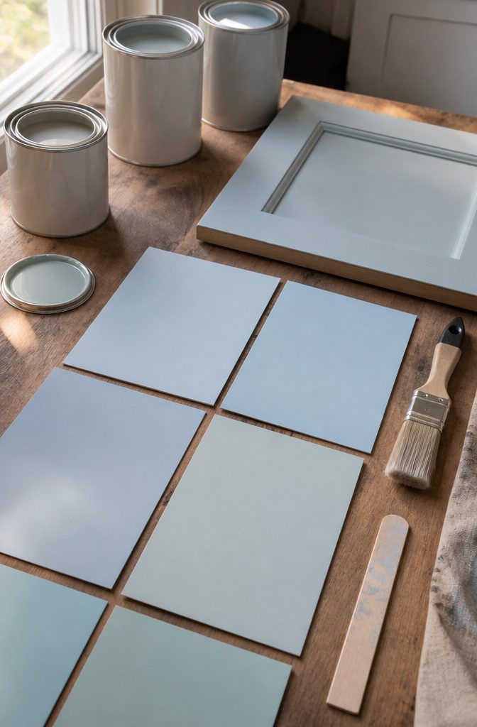
Since some light-blue paints read as medium blue across a full wall, check the manufacturer’s LRV before choosing.
Does it actually read as light blue?
Plenty of colors sold as light blue turn out to be medium blue once they cover a full wall.
Before trusting a name, I look for the manufacturer’s lightness number, often listed as light reflectance value (LRV) on a 0–100 scale, where higher means lighter.
Then I compare it with photos of the color in finished rooms, since a screen swatch can look paler or deeper than the real thing.
Teal-leaning and grayed-navy shades are the usual impostors. Deeper blues also make an enclosed kitchen feel smaller, and undoing a dark cabinet color is real work.
Small or windowless kitchens call for the closest check. In a big, bright room, a slightly deeper blue on one accent wall is lower risk.
Undertone and lighting shift
Blue is the color most likely to change character over a day.
A shade that leans gray at noon can look green under a warm bulb or purple in dim evening light. Brands usually describe undertones in their color notes, and real-room photos show how those play out.
Orientation matters too: north-facing kitchens tend to cool everything down, while south-facing light warms it. Owner reports often mention surprise at night, when pendants and under-cabinet strips take over.
Galley and windowless kitchens that rely on artificial light should weigh this most. If your kitchen gets steady daylight and you mostly use it then, the shift matters less, though a look under your own bulbs is still worth it.
Surface and finish
A color suggestion does not tell you whether a particular paint belongs on cabinets.
Check the product page for the interior applications it lists and for the finishes offered in that exact color. Wall paint and cabinet paint are often different products, and kitchens add grease, steam and constant wiping.
Walls usually do fine with a washable matte or eggshell, while cabinets tend to call for a harder, more durable formula in satin or semi-gloss. Sheen also changes how blue looks, since glossier surfaces reflect more light.
Anyone painting cabinets should care most; a mismatch shows up as chipped edges and sticky doors. For a ceiling or a low-traffic wall far from the stove, finish carries less weight.
Sample availability and cost
Sampling is the budget-friendly way to catch every problem above. Brands tend to offer some mix of small paint pots, printed color cards and peel-and-stick sheets, and the listed prices and ordering terms vary, so compare them before choosing.
Peel-and-stick samples can move from wall to wall without patch painting. In any form, place the sample near your counters and cabinets and check it in the morning, at midday and in the evening.
Buyers torn between 2 or 3 similar blues get the most from this step. If you’re matching a color you’ve already seen in a kitchen like yours, a printed card may be enough.
Compatibility with existing finishes
Blue has to share a room with counters, floors, wood tones, appliances and hardware, and each one pulls the color a different way.
Warm wood and brass tend to settle a gray-leaning blue, while stark white counters can make a pale blue look icier.
Stainless appliances usually sit easily beside cool blues, and black hardware sharpens them. I lean on pairings the brand states and on real-room photos with finishes close to yours.
Renters with fixed counters and flooring should care most, since those can’t be swapped. Someone planning a full remodel with finishes still undecided can let the other materials come first and pick the blue last.
Coverage and total project cost
Paint pricing looks simple until you run the math. Compare the container size and the coverage per container that the manufacturer publishes, then measure your wall area, subtract large openings and plan for 2 coats.
Light blue over a darker existing color may need primer or extra coats. Cabinets add degreaser, sandpaper, primer and either many hours of labor or a hired painter, so the color is a small slice of that budget.
Wall-only painters in a small kitchen can skip the detailed math, since one container may cover the job. Check the label for the coverage figure before you buy.
Kitchen examples and exact color identification
Inspiration photos are where blue gets slippery. Some pages admit that the pictured cabinets are custom-mixed or only close to the suggested shade, so a lovely kitchen photo may not match any color you can buy.
I look for the exact color shown in a kitchen and note whether it’s on walls or cabinets. Before ordering, confirm the manufacturer, full color name and code against the brand’s own listing, since similar names appear across brands.
Buyers working from Pinterest pins should care most. If you’re choosing from a brand’s chips in person, the code is already on the label, and photo matching matters much less.
How the Top Picks Compare
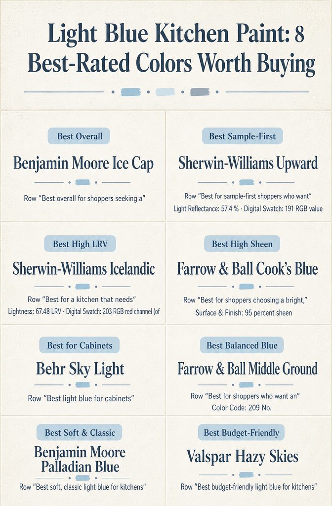
Icelandic’s LRV of 67.48 reflects more light than Upward’s 57.4, a useful difference in a kitchen with one small window.
Light reflectance: Icelandic vs. Upward
Both are pale blues, but their light reflectance values (LRV) pull them apart. Icelandic comes in at 67.48 and Upward at 57.4.
That 10-point gap means Icelandic sends more light back into the room, so a kitchen with one small window reads brighter and airier. Upward absorbs more, which gives it a softer, grayer look.
Its swatch values of 191, 201 and 208 sit close together, and that tight spacing is what makes a blue read muted. If your kitchen faces north or gets little daylight, Icelandic is the safer pick.
In a kitchen with a big south-facing window, the gap matters less because sunlight does the brightening, and Upward’s quieter tone can feel calmer than a true powder blue.
The dark end: Oval Room Blue
At LRV 32, Oval Room Blue reflects little more than half as much light as Upward. It isn’t a pale kitchen blue at all, and that’s the tradeoff.
A color holding that much pigment tends to look noticeably different at 8 a.m. than at 6 p.m., which suits a kitchen where the light swings through the day and you want the walls to change with it.
It’s a poor match for a windowless or galley space, where the same depth can make the room feel smaller.
Owners who like a moodier look will accept that; anyone after an airy kitchen should stay with Icelandic or Windy Sky.
Previewing before you buy
Upward’s on-screen swatch is handy for ruling colors out, and a pale, muted blue survives the trip from monitor to wall better than most. Screens vary, though, so treat it as a first cut.
Oval Room Blue calls for the opposite approach. Its 100 ml sample is worth the wait, because a deeper color needs to be watched across a full day on your own wall.
I’m leaving Cook’s Blue and Middle Ground out of this comparison on purpose.
Middle Ground’s code of 209 is a catalog number, not a measurement, so it says nothing about brightness. A physical sample will tell you more about either color than the sheet does.
Sampling in the kitchen
Digital swatches and inspiration photos only show what a screen does with a color. Light blue is the paint family that suffers most from that, because a pale shade has little pigment to hold its character when the light changes.
The sources I read agree on this, and they also note that some pictured kitchens use custom or approximate colors, so a photo is not proof of what a named can looks like.
Peel-and-stick samples beat painting swatches on the wall. A standard sample runs 9 × 15 inches, and an extra-large one runs 15 × 18 inches with twice the coverage.
Both are made with 2 coats of real paint. Because they move, you can shift them around the room instead of judging one patch of wall.
If you’d rather use sample pots, paint a large board and do the same. One retailer suggests setting the board beside your flooring, counters, fabrics and woodwork.
Check each sample at 3 times of day: morning, afternoon and evening under your artificial lights.
Window direction matters too. Owners and retailers describe north light pulling pale blues cooler and greyer, east light making them clearer and warmer, and west light turning them warmer and richer by evening.
Test 2 or 3 candidates side by side. Pale blue often reads as gray or green on the wall, and that is much cheaper to learn from a sample than from a finished room.
When thoughtfully chosen, blue can pass as a neutral while still infusing just the right amount of personality into a space.
Coordinating the kitchen palette
Light blue has to get along with whatever is already in the room: counters, flooring, wood, appliances and hardware. Those fixed finishes decide which blue works, so start with what you can’t change and choose the paint last.
White counters are the easy match, and the blue looks crisp against them. Natural wood warms a cool blue, and stainless steel stays neutral beside it.
Brass adds contrast against a pale shade. For a lighter, cleaner look, one design source pairs a pastel blue with white subway tile and chrome.
Lightness shifts the whole mood.
The pale blues I compared list light reflectance values of roughly 57–67, while a medium blue in my research sat near 25. That gap separates airy from moody, and in a small kitchen you see it right away.
Light direction changes the pairing too. One retailer describes the same blue as cooler and greyer in north-facing light, clearer and warmer in east-facing morning sun, and richer in west-facing late afternoon.
A blue that flatters your oak floors in one house can lean gray in another.
Put a large peel-and-stick sample, 9 × 15 inches at minimum, right beside the counter and floor. Check it in the morning, in the afternoon and under lamps at night, and move it around the room.
If you plan trim or ceilings in white, compare that white against the blue sample as well, since some makers list a matching white for each color.
Preparing painted cabinets
Painting cabinets is a bigger job than picking the blue.
A Reddit thread on repainting oak says doing it well takes multiple steps and a lot of work, and the cabinet pages I read rarely spell those steps out. So I went to the paint makers’ own descriptions.
Start with the finish.
Wall paint and cabinet paint are different products. One manufacturer calls its flattest finish gently wipeable but not washable and lists it for low-traffic walls and ceilings.
That is a poor fit for door fronts that get handled every day. Look for a finish the maker lists for interior wood.
Primer is next. Some makers name a specific one for each color: mid tones for some blues, a dark tones undercoat for deeper ones.
Use the primer named for your shade. A pale blue over dark stain or orange-toned oak depends on it to read pale at all.
Before any of that, test the color on the cabinets themselves. A 9 × 15 inch peel-and-stick sample is made with two coats of real paint, and a 15 × 18 inch version covers twice the area.
Stick one on a door and check it in morning light, afternoon light, and under your evening lamps. Designers also point out that countertops and flooring change how a blue looks, so keep the sample next to them.
Frequently Asked Questions
Which light blues are actually light, and which are medium or deep?
Check the lightness value (LRV) rather than the color name. Among the colors I compared, the genuinely pale blues list LRVs of roughly 57–67, while the medium and deeper blues sit around 25–32.
A manufacturer describing a color as "bold" or "deeply pigmented" is also a sign it won’t read as pale. Some of these numbers come from third-party pages, so confirm them with the paint brand.
Will a light blue look gray, green, or purple in my kitchen?
It can lean any of those ways, and the room’s light decides which.
One retailer describes the same blue looking cooler and slightly greyer in north-facing light, clearer and warmer in east-facing morning sun, and warmer and richer in west-facing late afternoon.
Check your sample in the morning, the afternoon, and under your artificial lights before you commit.
Will light blue make a small kitchen feel airy or washed out?
It usually keeps an enclosed kitchen feeling open, which is the opposite of what dark cabinet colors can do in a tight space.
The risk is going too pale: designers describe some of the lightest blues as nearly neutral, and in cooler light they can look flat or chilly.
If a sample looks too faint in your room, step up to a slightly deeper pale blue instead of a medium one.
Can I use the same light blue on walls and cabinets?
Not automatically, because a color suggestion doesn’t tell you whether a particular paint is right for cabinetry. Look at the product and finish the brand lists for your surface.
For example, one very matte finish (around 2% sheen) is meant for low-traffic walls and ceilings and is gently wipeable but not washable, while a full-gloss finish (95% sheen) is listed for interior and exterior wood and metal.
Cabinets also take more prep and labor than walls.
How can I tell if the color in a photo is the real paint color?
Often you can’t. Some inspiration pages say the pictured cabinet color is custom or only an approximation, and screens shift color on top of that.
Confirm the manufacturer, full color name, and code on the brand’s own listing before you order samples or paint.
What’s the best way to test a light blue before buying?
Use a large sample and move it around the room. Peel-and-stick samples come in sizes like 9 × 15 inches, with an extra-large 15 × 18 inch option offering twice the coverage, and some brands sell 100 ml sample pots.
Set the sample beside your flooring, countertops, and woodwork, and look at it at different times of day. Sampling matters most with made-to-order colors, since one brand lists those as non-returnable.
Will a light blue go with my counters, floors, and hardware?
Only a side-by-side test settles it, since the sources I read don’t document exact pairings for most of these colors.
Hold your sample next to your counters, floors, wood, and appliances, and include the paint color of any room that opens onto the kitchen.
How much paint do I need?
Divide the square footage you’re painting by the coverage printed for your specific paint.
One retailer lists 480 square feet per gallon for a gloss finish, but that’s a retailer figure, so check the can or the manufacturer’s page for the product you choose.
The sources I found don’t settle how many coats a given blue needs. Some brands do recommend a specific primer or undercoat for certain blues, so read that recommendation before buying.